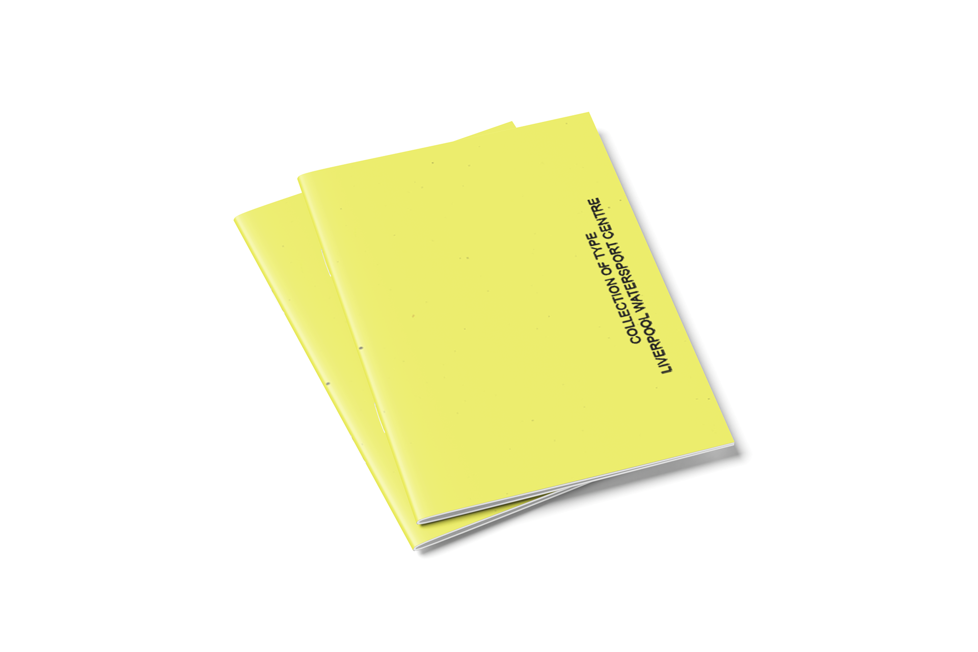
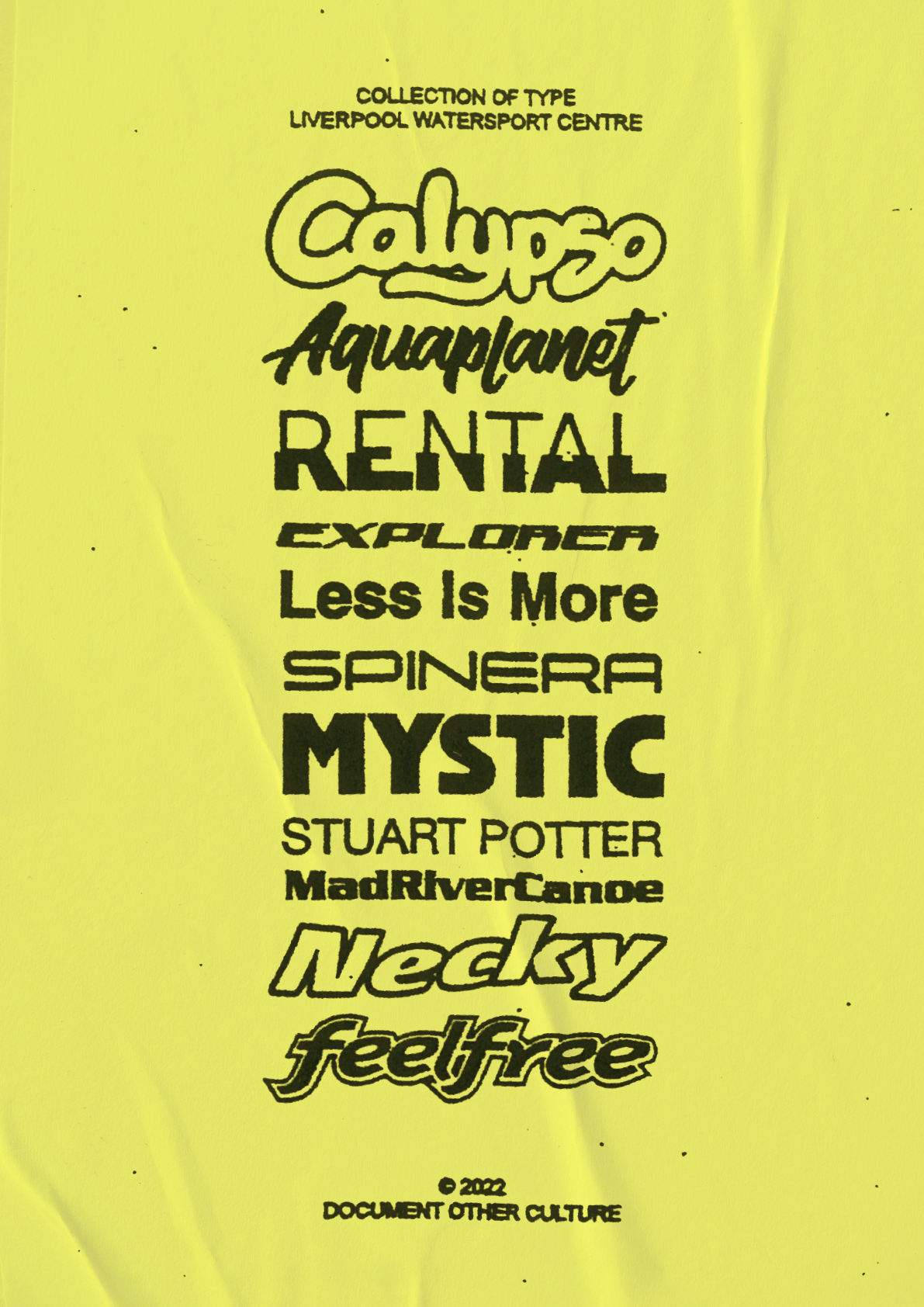

I was assigned the task of documenting a culture I was unfamiliar with, a local boat & water-sports venue. I created two posters, one which folded into an A6 zine & one A2 in scale. Each poster documented a collection of type-faces found at the ‘Liverpool Watersport Centre’. Each typeface was found on a boat at the centre. It is effective how when grouped together as a collection and stripped of colour & decoration - the typefaces looked like they could be a family of fonts. I printed the outcome on Fluorescent paper to give the feel of a flyer, which could be posted on the noticeboard at the centre.